An effective website drives traffic to your product. If your product is a physical location, your website must entice people to visit that location. This can be a challenge when your site’s content doesn’t align with your target visitors' needs.
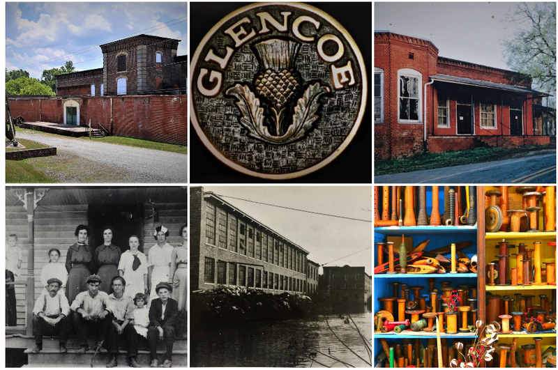
This project evaluates the existing website content of a small, niche museum in North Carolina. The Textile Heritage Museum is a restored textile mill town representing life for textile workers in the late 19th and early 20th centuries.
I analyzed the effectiveness of this content in relation to audience needs and the website’s general purpose, identifying gaps in information and opportunities for improvement. The site has an inconsistent voice and is updated sporadically, making it difficult for visitors to plan their visits around special events. I also identified three other museums along the East Coast that share a similar target audience. I compared their sites to Textile Heritage’s site to find where Textile Heritage would be losing visitors to those museums.
After identifying the issues, I proposed a new content strategy to improve the site’s ability to attract visitors to both the website and the museum, leveraging my understanding of effective user interfaces, visual communication, website design, and target audience identification. This project demonstrates the dual nature of a web designer’s job as both analyst and creator when working with existing sites that need updating and upgrading.

Reaching a target audience through a website can be achieved by improving the site itself. Sometimes these improvements are not enough. Instead of waiting for the audience to come to you, you can remind them of your presence (and of the information and knowledge you have to offer them) by expanding your outreach.
I chose to do this with a blog as part of the new content strategy for the Textile Heritage Museum’s site. I wrote two blog posts and a social media post announcing the blog’s launch. The blog posts had to maintain the look, feel, and voice of the new content strategy's direction while still creating something interesting and new. This gave me the opportunity to do some deep, wide-ranging research, an aspect of this project that I especially enjoyed, and practice writing for a specific audience.
Given the depth of information available on the history of cloth, weaving, mills, etc., choosing the information for the blog posts was challenging. Transforming information into usable text is a foundational skill for technical communicators. This project shows how to provide the audience with interesting and fun information without overwhelming them, attracting visitors to the website and the museum itself.
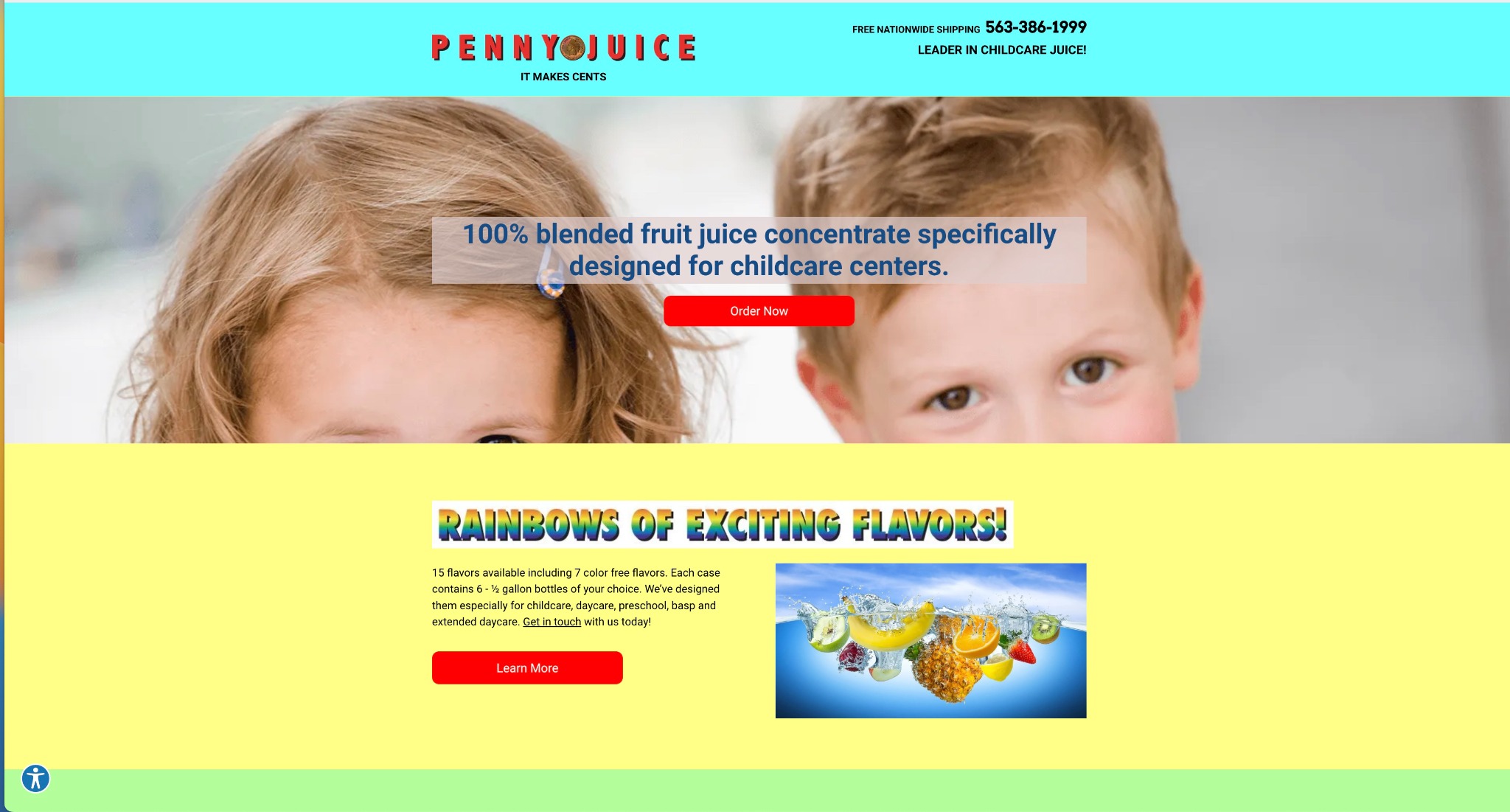
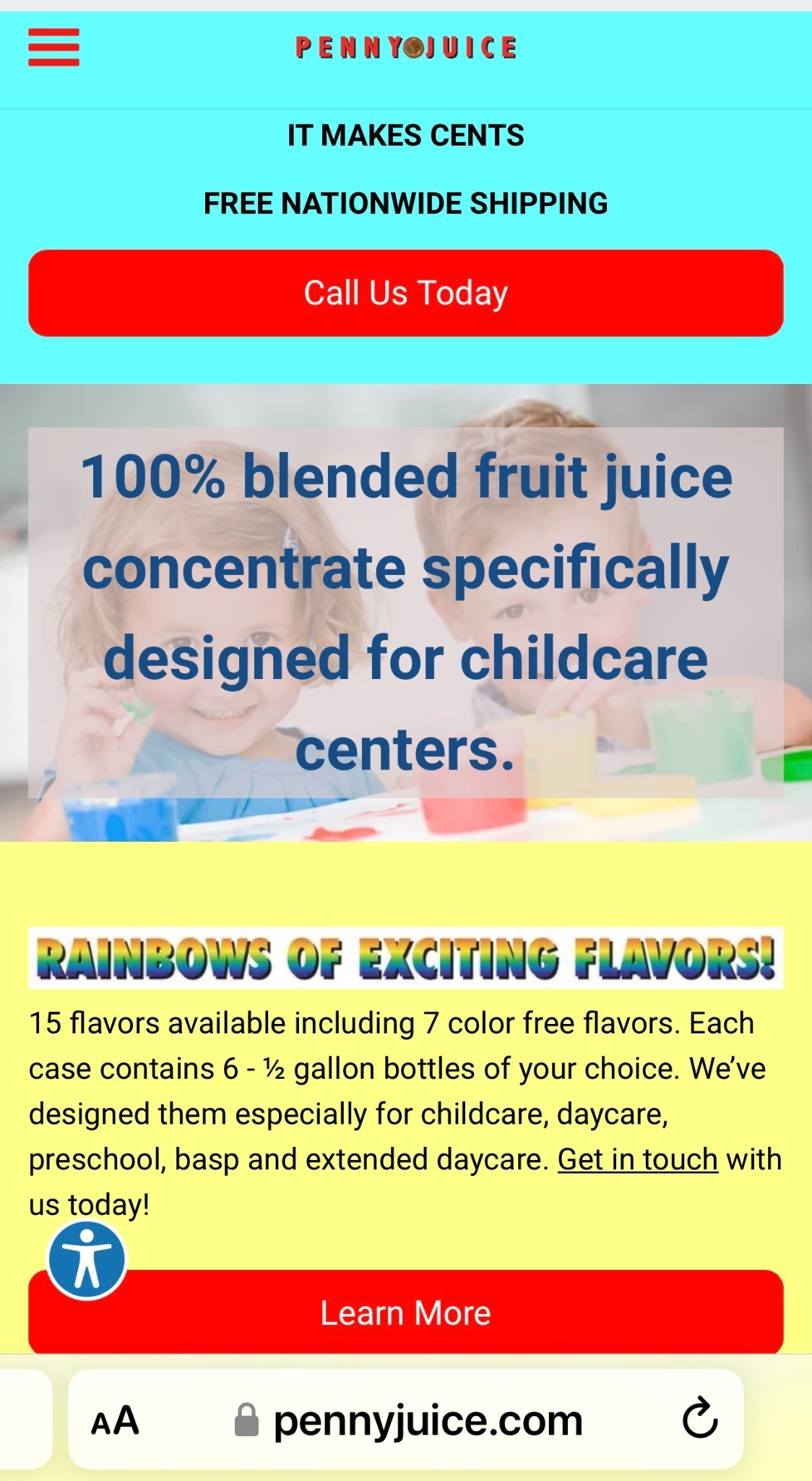
Commerce websites really took off in the 1990s. Some sites have been updated as tastes have changed, while others have remained locked in their original designs for decades. Penny Juice is definitely in the latter category. Their brightly colored site, with an awkwardly cropped picture and word art headings, feels dated and tired. These are not the impressions you want to make on customers.
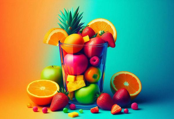
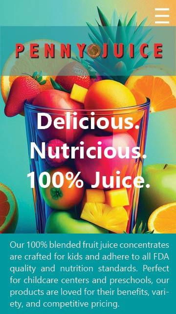
Here, I have redesigned the home page to give the same information and navigation options, maintaining the site’s basic usability, while improving visual appeal through graphic design. The original site had scale issues. The picture is very large, but the text is very small. That text describes the product and should therefore be more prominently featured. Everything gets a little lost in too much negative space. There is a good photo of the fruit falling into the water, but it’s too small to be effective. It would have been better used as the hero photo instead of the picture of those kids’ foreheads.
Inspired by that fruit-in-water photo, I leaned into the 100% Juice message for my redesign. By focusing the text and imagery on the fruit, I was able to create a cohesive site that better balanced its design and practical needs.
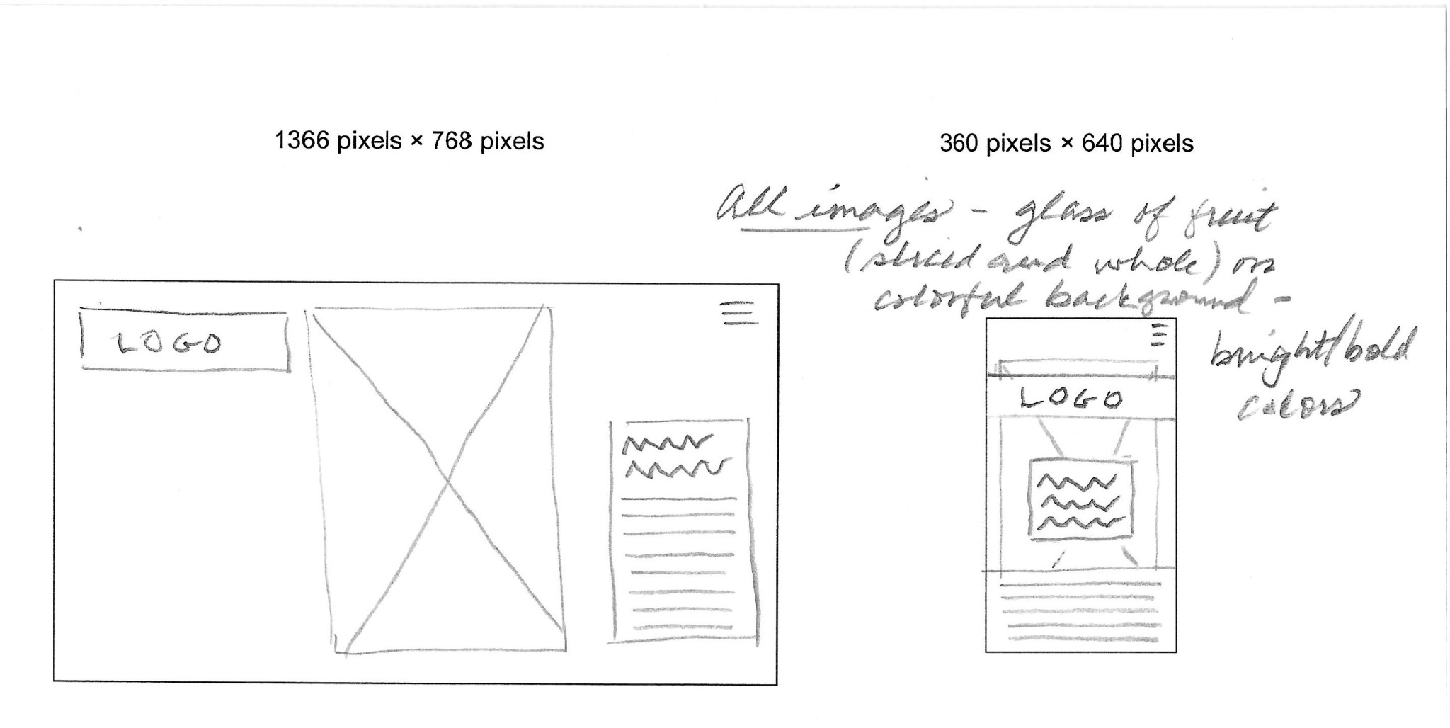
The project followed a traditional, iterative process: creating wireframes on paper before moving to digital tools to produce mobile and desktop versions of the layouts. Producing versions for different screen sizes required flexibility and problem-solving skills to effectively apply graphic design principles while still including all required navigation and text elements.
The project was created with Adobe InDesign. We were encouraged to experiment with AI-generated images for this project. The image was generated using Microsoft Creator, but InDesign was used to perfect it. Given the incredible speed at which AI technology is advancing, experience in generating and correcting AI-generated images has many applications.
Whereas other work in this section features content analysis and redesign, this is a full proposal for a website built from scratch. The client is Gustav Vogel, a fictional persona of an older gentleman who owns a fine clock and watch repair and design shop in Berkeley, California. He is ready to create a website for his shop, which I will be designing.
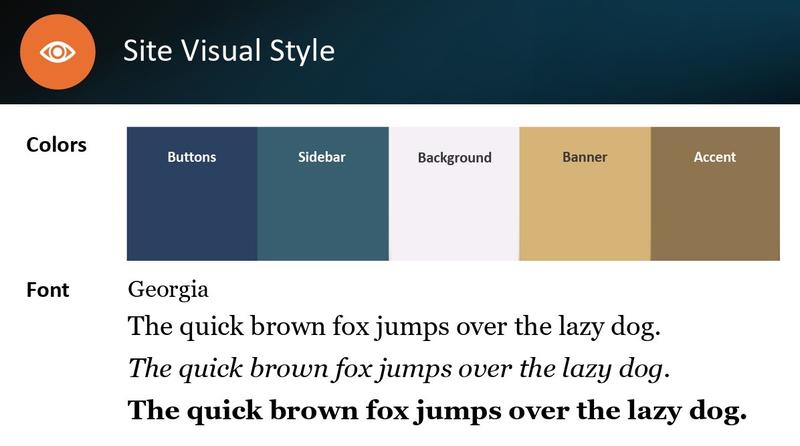
This project combines website design with the needs of the audience and the client. It represents a culmination of choices across the layers of website construction, including the underlying structure, navigation requirements, and visual design. Balancing these elements requires planning and organization, as well as creativity and consistency. Choosing items that work together, i.e., creating a style guide, is only half of the challenge. The final product must apply the style guide consistently to create effective design and useful elements. The sample pages show how all the planned elements come together in the final product.
Studying web design has helped me improve my concise writing, such as prompts or form instructions. It has also helped me better understand how readers scan content online and how to format paper documents to achieve a similar reading ease.