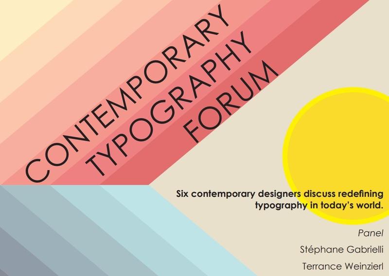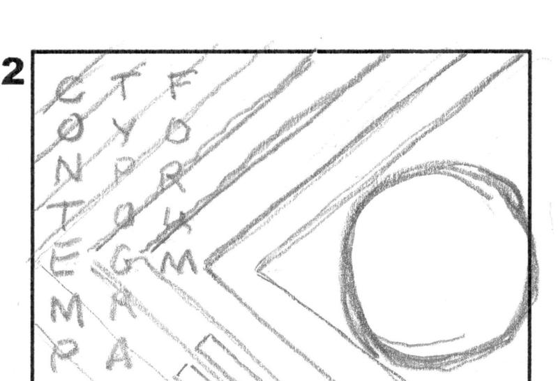
This poster for the Contemporary Typography Forum is a traditional graphic design project, created from a brief outlining the pertinent information to include. I had free artistic license. The project was iterative, with the professor acting as the artistic director, providing advice and suggested improvements between iterations. The project started as pencil sketches for approval before moving on to Adobe InDesign to create initial proofs. Those proofs then received additional feedback before being finalized. Not only was this a dose of real-life workflow, but it was also a lesson in abandoning work and moving in a different direction, regardless of any attachment to the original idea.
Though I am primarily a writer, a firm grounding in graphic design helps me focus on how fonts, spacing, and visual hierarchy can improve how readers use and understand a written document.

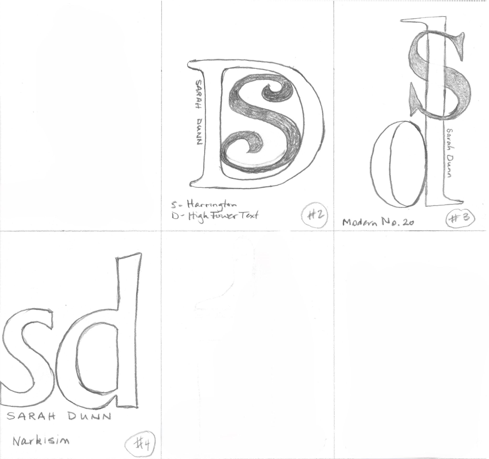
This project involved creating a personal branding logo using my initials. It was my first time using Adobe Illustrator. It gave me the opportunity to learn the basics of the software and explore typography and basic design principles. To create a visual identity from something as simple as two letters, I experimented with multiple font options to find the appropriate professional tone. I considered proportion, alignment, and negative space to create a visually effective logo. Here, I have included the original brainstorming sketches as part of the iterative design process.
Data can be messy. In a sea of figures, it can be difficult to spot trends and patterns. Data visualizations highlight the important data, pointing others to the key insights. A well-designed data visualization can make presentations more persuasive, aid in decision-making and priority setting, and help others understand complex data more easily.
This three-slide PowerPoint presentation was the result of a challenge to convey complex Bureau of Labor Statistics information through images and infographics, using as few words as possible. Creating these minimalist slides demonstrates my ability to analyze data for key insights and present them in a way viewers can follow, even without additional context.